Introduction
This blog post aims to describe how the groupby(), unstack() and plot() DataFrame methods within Pandas can be used to on the Titanic dataset to obtain quick information about the different data columns.
This blog post assumes that the Kaggle Titanic training dataset is already loaded into a Pandas DataFrame called titanic_training_data. For more information about how the data can be loaded into a Pandas DataFrame click here.
Using the groupby(), unstack() and plot() methods to investigate the “Sex” column
The page describing the Titanic challenge on Kaggle gives some clues about the data:
“Although there was some element of luck involved in surviving the sinking, some groups of people were more likely to survive than others, such as women, children, and the upper-class.”
How can we check that the above statement is true? Pandas DataFrame functions will help us do this, specifically we can use the groupby() and unstack() functions. The use of these functions can easily be demonstrated using the Sex data column as it only has the two options of female and male.
The groupby() function
The groupby() function is super useful as it allows summary statistics to be obtained for different categories of data within a Pandas DataFrame. To use it successfully requires two decisions to be made:
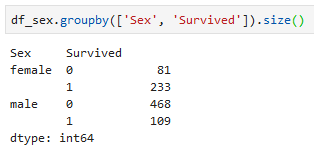
- Decide what column(s) to group by. In this case we want to see if Sex has an impact therefore we will group by ‘Sex’ first. We also want to see how many people within each sex survived in the training data so we will want to group by ‘Survived’ as the second layer.
- Decide what type of descriptive statistics should be performed on each group e.g. are we interested in the average of a group or just the total number of occurrences or something else? There are many available options for descriptive statistics, a detailed list can be found in the Pandas documentation.
Multilayer groupby()
To avoid messing up the training data a new DataFrame called df_sex is created. The groupby() function is called on the df_sex DataFrame with ‘Sex’ as the as the category we wish to group by. The size() function is called on the groupby() function which calculates the total number of rows in each group e.g. the number of males and females. If there were missing data which we wished to exclude then the count() function could be used instead of size().

The above shows that there are 314 females and 577 males in the Titanic training data. This is all good and well but we want to see how many males and females survived. This can easily be achieved by adding the ‘Survived’ column as a category to group by after ‘Sex’.
Using the unstack() function to make survived (0 and 1) as column
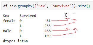
Grouping by the ‘Sex’ column and then the ‘Survived’ column is taking us in the right direction. What I really want is a column which tells us the percentage of females and males that survived. To do this we need to make columns out of the groups within the survived column (0 and 1) using the unstack() command. I have tried to show this in the annotated picture below:
Using the unstack() function we can obtain something similar to above annotated DataFrame:

We can now create a column which corresponds to survival percentage:

Now we can clearly see that in the training data ~74% of the females survived whilst only ~18% of the males survived!
Using the plot() function
We saw above how the groupby() and unstack() functions can be used to determine the survival percentage amongst males and females. We can come to similar conclusions by visualising the data using the plot() command on a groupby() or DataFrame object in Pandas.
For example to generate a pie chart showing the percentage of males that survived requires a slight modification of the groupby() code that was described above:

Specifically the data in df_sex DataFrame was filtered so that only rows corresponding to males were present. Then the plot.pie() commands were added to the previous groupby() commands to generate a pie chart. I originally wanted to generate an individual pie chart for males and females using one line of code, however, I could not figure out how to do this. I have achieved a similar goal using histogram plots using the by keyword, however, this did not seem to work for pie charts.
General Comments
I have shown how Pandas groupby(), unstack() and plot() can be used to gain quick information about the Sex column within the Kaggle Titanic training dataset. It does seem to be true that females have a higher survival rate on the Titanic compared to men. I have used similar methods to that described here to examine the remaining columns in the training dataset. My next blog post will focus on cleaning up the ‘Cabin’ column as this will require some string processing to get more valuable information.
